Abstract Wear Online Archive
Web design / Art direction / Fashion design / Animation
This archive documents results of artistic research in the field of fashion design, which was carried out within 'Lisa Shahno Abstract Wear' brand over several years.
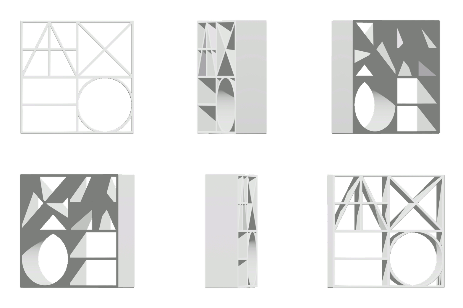
Direction of the study was narrowed by the choice of visual language of elementary geometric forms. All the designed objects had one common starting point - an abstract grid divided into different numbers of squares, rectangles or triangles. Thus, the narrative of the designed pieces was freed from the pressure of utilitarian meanings associated with clothing.
The detachment process, in turn, was intended to provoke a contradictory dialogue between the familiar understanding of the human body and abstract minimalistic shapes.
Logo
Read more >>>
'Lisa Shahno Abstract Wear' is an extension of SHAHNO brand, so the main logo was chosen to represent the sub-label's archival projects.
The logo is based on Cyrillic transcription of the surname SHAHNO and is a combination of five letters of the Cyrillic alphabet /ШАХНО/. The letters have been simplified to basic structures inspired by the grid of the Roman Capitalis Monumentalis.
The first two letters of the surname are combined into one module and together with the other three letters, form a square word-image block that communicates using globally understandable abstract primary signs such as a circle, a square and a triangle.

STRUCTURE
- The basis for the distribution of site elements is a responsive six-column grid build with a flexbox
- Below the header is a slideshow window with three looped images
- Content is divided into three chapters: Sets, Objects and Speculative Pop-up Store
- Elements of the chapters are presented as a series of cards with a mouseover effect
VIVID PURPLE
#8100FF
BLACK
#000000
WHITE
#FFFFFF
GRAY
#A3A3A3
Colors & Font Family
Read more >>>
Color language of the site is achromatic: the protagonists are black, white, and gray. Despite the colorless look of the pages, characterized by large white spaces and minimalistic compositions of black lines, purple color accents are also present and become noticeable when the cursor is hovering over text elements in the header or footer.
JOST font family was chosen for the site, inspired by the "geometric" or "constructed" sans-serif linear antiquas developed in the early twentieth century. The letterforms are closely related to basic geometric shapes and correspond to the general visual language of the project. The font styles of the family have been distributed in the layout as follows:
- HEX #8100FF / Vivid purple
- HEX #000000 / Black
- HEX #FFFFFF / White
- HEX #A3A3A3 / Gray
JOST font family was chosen for the site, inspired by the "geometric" or "constructed" sans-serif linear antiquas developed in the early twentieth century. The letterforms are closely related to basic geometric shapes and correspond to the general visual language of the project. The font styles of the family have been distributed in the layout as follows:
- Headers in ’Medium’ uppercase
- Sub-headers in ‘Light’ uppercase
- Body text in ‘Regular’ sentence case
- Captions in 'Italic' sentence case


Subpages architecture
Read more >>>
For the subpages a responsive slideshow gallery from W3Schools 'How To' library was adapted.
All the subpages have the same layout: at the top is a large image with a photographed 3D item and its unfolded 2D construction. Below that are previews of other images from the same project, and at the very bottom is a block with a description.
The subpages are divided into three chapters:
All the subpages have the same layout: at the top is a large image with a photographed 3D item and its unfolded 2D construction. Below that are previews of other images from the same project, and at the very bottom is a block with a description.
The subpages are divided into three chapters:
- SETS /SET/ which includes experimental fashion collections
- OBJECTS /OBJ/ showcasing individual fashion items
- SPECULATIVE POP-UP STORE /THNG/ presents one of the conceptual installations dedicated to the ambiguity of words related to clothing


